Wednesday, June 09, 2010

Which comes first?

My friend Dana complained, "What the heck is that font that all the massage therapists and chiropractors use?"

"Papyrus?" I asked.

"YES! Oh! It is such a poor choice for a logo! And it's awful on a sign: the stroke is so thin and ragged. But do you know what I hate more? Is when a sign maker just uses any old font and then two months later the business owner realizes they need a logo, and I get called in, and then they have a design that might or might not fit their signage!"

It's true that a fair proportion of folks opening a storefront don't have a logo or a designer. They know they need a sign, but they don't know they need consistent branding even more. In my experience perhaps half of the business owners are trying to launch before they have their logo and collateral.

Depending upon the expected clientèle, a start-up business opening a brick and mortar should budget between $2k and $10k for design. An excellent designer will create a cohesive, consistent, communicative brand with a logo, colors, collateral templates, and usage guidelines, so the business owner can get signs, business cards, webpages, and print collateral.

Tuesday, April 15, 2008

Appropriate Photoshop


Photoshop is certainly one of the most mis-used apps in the designer's toolbox. Spend anytime at Photoshop Disasters and you know what I mean. But in the hands of an expert (like me! ...blush...) it can take parts of several images and combine them to really send a strong, cohesive message.

On this shoot, we really only got one good pic of the father/son team, so my task was to use it but with a better story going on in the background. The lighting was in my favor; strong overcast made for easy to blend shadows. Assembling the background from three different shots, cloning out the external hardware on the building, increasing the legibility of the school's title, and beautifying the van all came together to make a great finished piece.

Oh yeah, and simple stuff like rotating the hue of the vest so it's the correct, "corporate" color, adding logos, that stuff is child's play.

Friday, August 03, 2007

Logo for Sensory Revolution


Whew, what fun this was! If ever I felt upstaged by a client's knowledge of communicating with symbols, this was it. I found it completely delightful to work with such a high vibration. I haven't felt that amount of good stress since my first real designer job, twenty years ago!

The client was great. We worked well and fast, met her deadline, and made her happy. She'd been living with this project for over a year, and finally decided to hire someone to help her get to the finish line. Three days and dozens of interactions later, we were done!

As evidence of my nervousness in the early stages of the project, I'm sharing with you this terrible set of introductory sketches:

Thursday, April 12, 2007

Website re-design in the wings


I'm imagining a new web design for Pixel Rangers. I really want to break the information up into smaller chunks. The idea of being part of a small business launch support team is quite powerful, but I've not done a good job of capitalizing on this.

I'm experimenting with a chalk-board sort of look for the imagery. I want something that speaks to the specific goals of start-ups, the place of invention and potentialities. I think a sketch-based image set would communicate this.

Tuesday, February 27, 2007

Tolerants, working around the problem

My business coach wants me to keep clearing out those things that I put up with, that I tolerate.

My version of Word, for example, doesn't do the sub-menu thing. For example, I can't insert a picture using the menu. So I insert a picture from the drawing toolbar.

I just had to make a page break. Yep, can't do it from the menu. But I can write the word "break" and then do a find and replace with the special characters (it's a "^m" if you don't already know).

If I used Word more, I'd certainly take the time to re-install it.

Tuesday, February 20, 2007

A stack of logos


Logos! When I custom design a logo, I slip between the roles of coach and designer. "Why are you in business?" I'll ask my client. "What makes you passionate about what you do? What makes you unique? What do your clients expect of you?" I help my clients understand that a great logo is designed for their clients. A logo is the initial aha! connection between them and their best customers.


Monday, February 19, 2007

Another stack of logos


These logos are more or less square, while those above are more or less rectangular. Many of these logos use color. I certainly have a "style," but not as much as some designers. I work very hard to create the imagery and visual communication that works best for my client. I'm very aware that what works great for someone who is intuitive doesn't work for someone who is more concrete.


Thursday, October 19, 2006

A tale of three logos

[image removed by request]


Whew! I had to really stand my ground with this client. Thankfully, I did. I realized he was a powerful selective listener, so I quickly switched over to exclusively emailing back and forth.

I negotiated a very clear starting point, and so I was able to design this logo for under $300. Yes, I know, it's a fabulously good value. But I really kept my time down. Interestingly, the client feels he paid a premium, and spent some time trying to convince me he was doing me a favor, paying "so much money!" I wonder if I bought a property with him and paid him a 1% commission, would he feel like he'd been fairly compensated? Perhaps he would, if he'd done as much as he could to limit and control the mechanics of the transaction.

He's still trying to get some free work out of me, too. It's sort of fun to note all the negotiating tricks, and see through them.
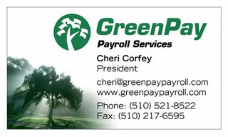

This client used an online tool to combine some clipart with her business name. Her first run of cards was sort of mundane. She asked me to dress it up.

She has a tagline, "Get give and go green." We agreed to come up with a set of images to fit each of these ideas, but "give" gave us some trouble. I finally realized the problem: we needed a single, cohesive image that captured all three values, not three icons. This tree in the dawn's mist worked out fine; it suggests the dawn of a new day full of hope, spirit, and productivity, because you get to focus on your passion while she handles the drudgery of your payroll. Her testimonial:
I LOVE IT!  You are truly amazing and have a great gift.  Thanks for sharing it!  Let's go with this one.
Thanks
Cheri


And finally, in the "Don't let this happen to your friends" category, I've been sent this self-designed logo. Yikes! The restaraunt owner might be an excellent business man and chef, but he's sure not a designer. If you have a friend, husband, wife, brother, sister or cousin, who shows you the logo for their business that they designed themselves, please love them enough to educate them that their logo is the public face of their business. It's got to communicate the attraction of the business. It needs to be professionally designed. Things to watch for if you can't decide if they need help: use of Times Roman (or any other Windows font: Copperplate, Papyrus, etc), drop shadows, and coastal outlines are all indicators that the logo isn't going to attract customer's attention.

One thing this logo does have going for it is the rouge/red thing. It's obvious, but obvious is a good thing when you're competing for peopple's bandwidth.

Thursday, May 04, 2006

Sally Ann Jessie of Petlane™


One of my BNI compatriots is Sally Ann Jessie. She is a pet advisor: she helps people to play with and take care of their companion animals. The product line is designed by the smae lady who founded Discovery Toys, and they are so cool I almost wish I had a pet just so I could buy some! There's an elephant toy, for example, that is amazingly adorable and rugged, for playing with your medium-sized dog.

She got this cute VW Beetle, and it had someone else's contact info and a bastardized version of the Petlane™ logo. We put her contact info on the car, and of course I had to change it to use the correct logo. Branding, baby! Keep the "corporate" identity consistent!

I'm not like the logo police or anything, though.

Saturday, April 08, 2006

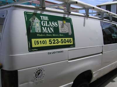
The Glassman, Truck Graphics

There's a vinyl graphic product that 3M created, and licensed to vendors all over the country. It's a large, colorfast print, with an adhesive on the back that is wrinkle and bubble free in the hands of anyone with patience.

I love using it.

This fleet of vehicles all got either magnetic signs or graphics applied directly to the trucks or vans. I merely duplicated the design the client made for herself some years ago. While my real strength is in design, I acknowledge that some people need me for my project management and production skills. And that's fine, just not as exciting.

What IS exciting is what I'm writing about over at my other blog.

Saturday, March 11, 2006

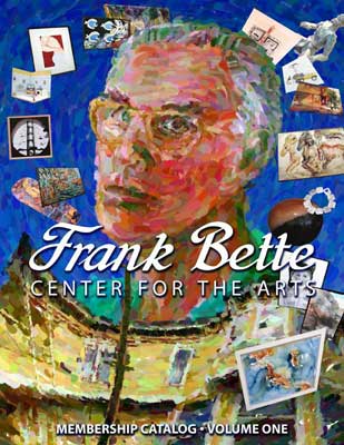
Illustration, cover art

I love this kind of project. This is a cover for an artist directory. Donna Layburn is a client and friend from a few years back now. She got onto the board of directors for the Frank Bette center, and then commissioned me to make this cover for them. They'd tried using artist volunteers, but with limited success. So under huge deadline pressure, she called me up and gave me the job. She told me, "It's got to be something that looks like it could sit on a coffee table. It's got to be about the art." The time was so compressed that no one was sure if my cover was going to make it to the press, so there was some confusion. But I pressed on! When she saw what I made, she left me this message for me.


donnastestimonial.wav
Powered by Castpost

I like doing one or two pure-design type projects each week. More than that I think I might begin to feel chained to the computer.

Tuesday, February 21, 2006

Perhaps I AM very good

The client wants his favorite tattoo as his logo.
So, an hour later, I've recreated it as a print-capable bit of art.

Monday, February 06, 2006

Looking at old work

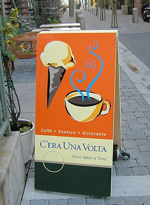
I've made a few sandwich signs. Only highway signs and traffic signals are more interactive. A sandwich sign sits in the middle of pedestrian flow, beckoning people to explore the adjacent establishment.

I designed the graphics and built this sign for C'era Una Volta. It's very heavy, to resist getting blown down. It's very tall, so you can see it. And I really like the graphic I came up with.
It's nearly two years old, has sat out in all kinds of weather, and it still looks good. The value of this sign is something I can't calculate; it's up to the proprietors. I do know that if I average the original expense over the expected lifetime of the sign, it's around 40c per day.

The hardest thing about sandwich signs is that they are not user-friendly. They can never really be heavy enough to withstand wind, nor can they be light enough to be easily moved. It's a system problem without a solution set. When a client asks for one, I work very hard to set their expectations so they will be pleased with the final result.

Wednesday, January 04, 2006

Negotiating after the fact

Dang it.

I've got a client who wants me to give away a design. This person got so frustrated during our conversation they hung up on me.

I think this might be a signal (because of how this client came to me, and how we began our work together) that it is time for me to focus in and specialize. I've been resisting this, because I know I appreciate working with people who are able to fulfill all my needs for a given project... but the world is certainly moving towards greater specialization. I can see where it could be more efficient. And I could control the beginning of my relationships better, and head off this sort of collision.

Dang it, I hate when agreement becomes argument.

One thing that is tough for many clients to understand is that I own my designs. I didn't set up the industry that way. But that's how it is, and that's how the IRS views it. Even if I give away me design, it's a piece of real property and I will owe taxes on it if it passes out of my control.

I listened to an architect today. He described how the process of designing a space results in ideas that are his, and he owns them. The drawings are used to communicate with a builder how to create those spaces, but the drawings are not the product: the ideas are. I was impressed to hear something graphic designers have to explain to their clients is something he has to explain, too, but it makes perfect sense.

Anyway, I'm all hepped on stress chemicals after that phone call, and I don't like it. I haven't done any yoga for a month it seems, so perhaps I'll take some time off right now and be good to myself.

Friday, December 30, 2005

Emojo business card


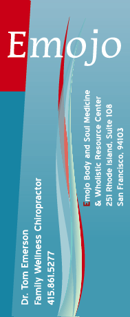
My friend Tom Emerson is discovering his right livelihood as a chiropractor. His adjustments combine energy, control, grace, and flow into a healing practice that is truly extraordinary. He needed a card that reflected these qualities, and this design fit pretty well. While I was trying to work within our discussed framework, this swooshy thing kept bumping into me, and so I decided to run with it a little ways.

I try very hard to honor a client's budget above all else. Sometimes this means the design is less than it could have been. In Tom's case, however, spending more time would likely not result in a better looking card. I got lucky, and the best design happened very quickly.

One thing: it's an odd-size card. Tom likes that it doesn't fit into people's card holders. When a designer is blessed with the chance to work on a non-standard substrate, he'd better make some use of the extra capacity! So that's one reason I quickly settled on this long, flowing water/fire shape extending the length of the card. I had the space, so I used it for something that wouldn't fit on a normal length card.

Friday, December 23, 2005

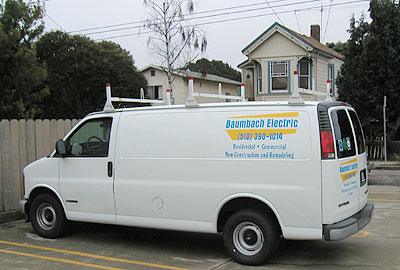
Baumbach Electric's new van


I love small, quick jobs and easy-going clients. Bruce Baumbach, electrician, called me yesterday and asked if I would letter his van. Would I! And here it is, ready to go, 24 hours later!

I charged $300 to letter two sides and the back. If I take the time to actually price this out per the letter, plus layout and file prep and all the other "industry standard" upcharges, it ends up being a $485 job. Many of my clients act as if spending $500 is going to send them to the poorhouse. Don't whine-- getting your name out there on your vehicle is the most cost-effective marketing dollar you can spend. How come Bruce saved $185? One main reason: during our first telephone call, I got a tickle that told me he was going to be an easy client. He didn't want lots of designs thrown at him, he just needed letters on his van, with maybe some "contrasting color" to help his name jump out.

He trusted my choice of letterstyle, and respected the fact that if he wanted some "logo design" I was going to charge him my logo design rates. He didn't nit-pick about the color of blue I had in-stock. He has email access and could look at a layout as soon as I finished it. He showed up with the van at the time we agreed upon.

He's clearly been in business long enough to know that any job worth doing is worth doing "good enough." I really respect that. So Bruce got the steep "get the job done and don't bother me" discount.

Wednesday, December 21, 2005

Art happens


This graphic showed up while I was working on a very different looking design. I'm entertaining the notion of assembling a show of the art that proceeds from my logos. It'd be fun, to see logos as art, stripped of their context.

Saturday, December 17, 2005

Sign Install at EMOs


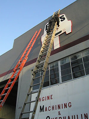
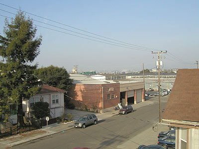
Here's a pic of my sign guy, Ken, 20 feet in the air, installing Sandie and Emo's new sign. I unmounted the previous, 120 pound sign all by myself (with two ropes and a ladder). The new sign went up very nicely. The old sign was installed 20 years ago by Emo and his dad. Oh! I have a pic of how high this is, from the other perspective:

I don't know why that's a big deal to me, but it is. Too bad it was a misty afternoon (felt like 40 degrees); had it been clear the Oakland Hills would have been beautiful.

The most surprising and memorable comment of the day: Ken said to Sandie, "I think Bob must have been my brother in a previous life." WTH!?