[image removed by request]
Whew! I had to really stand my ground with this client. Thankfully, I did. I realized he was a powerful selective listener, so I quickly switched over to exclusively emailing back and forth.
I negotiated a very clear starting point, and so I was able to design this logo for under $300. Yes, I know, it's a fabulously good value. But I really kept my time down. Interestingly, the client feels he paid a premium, and spent some time trying to convince me he was doing me a favor, paying "so much money!" I wonder if I bought a property with him and paid him a 1% commission, would he feel like he'd been fairly compensated? Perhaps he would, if he'd done as much as he could to limit and control the mechanics of the transaction.
He's still trying to get some free work out of me, too. It's sort of fun to note all the negotiating tricks, and see through them.
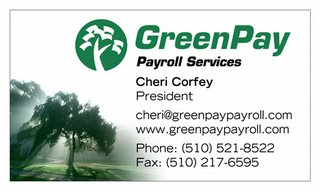
 This client used an online tool to combine some clipart with her business name. Her first run of cards was sort of mundane. She asked me to dress it up.
She has a tagline, "Get give and go green." We agreed to come up with a set of images to fit each of these ideas, but "give" gave us some trouble. I finally realized the problem: we needed a single, cohesive image that captured all three values, not three icons. This tree in the dawn's mist worked out fine; it suggests the dawn of a new day full of hope, spirit, and productivity, because you get to focus on your passion while she handles the drudgery of your payroll. Her testimonial:
I LOVE IT!  You are truly amazing and have a great gift.  Thanks for sharing it!  Let's go with this one.
Thanks
Cheri

And finally, in the "Don't let this happen to your friends" category, I've been sent this self-designed logo. Yikes! The restaraunt owner might be an excellent business man and chef, but he's sure not a designer. If you have a friend, husband, wife, brother, sister or cousin, who shows you the logo for their business that they designed themselves, please love them enough to educate them that their logo is the public face of their business. It's got to communicate the attraction of the business. It needs to be professionally designed. Things to watch for if you can't decide if they need help: use of Times Roman (or any other Windows font: Copperplate, Papyrus, etc), drop shadows, and coastal outlines are all indicators that the logo isn't going to attract customer's attention.
One thing this logo does have going for it is the rouge/red thing. It's obvious, but obvious is a good thing when you're competing for peopple's bandwidth.
No comments:
Post a Comment