Thursday, October 19, 2006

A tale of three logos

[image removed by request]


Whew! I had to really stand my ground with this client. Thankfully, I did. I realized he was a powerful selective listener, so I quickly switched over to exclusively emailing back and forth.

I negotiated a very clear starting point, and so I was able to design this logo for under $300. Yes, I know, it's a fabulously good value. But I really kept my time down. Interestingly, the client feels he paid a premium, and spent some time trying to convince me he was doing me a favor, paying "so much money!" I wonder if I bought a property with him and paid him a 1% commission, would he feel like he'd been fairly compensated? Perhaps he would, if he'd done as much as he could to limit and control the mechanics of the transaction.

He's still trying to get some free work out of me, too. It's sort of fun to note all the negotiating tricks, and see through them.


This client used an online tool to combine some clipart with her business name. Her first run of cards was sort of mundane. She asked me to dress it up.

She has a tagline, "Get give and go green." We agreed to come up with a set of images to fit each of these ideas, but "give" gave us some trouble. I finally realized the problem: we needed a single, cohesive image that captured all three values, not three icons. This tree in the dawn's mist worked out fine; it suggests the dawn of a new day full of hope, spirit, and productivity, because you get to focus on your passion while she handles the drudgery of your payroll. Her testimonial:
I LOVE IT!  You are truly amazing and have a great gift.  Thanks for sharing it!  Let's go with this one.
Thanks
Cheri


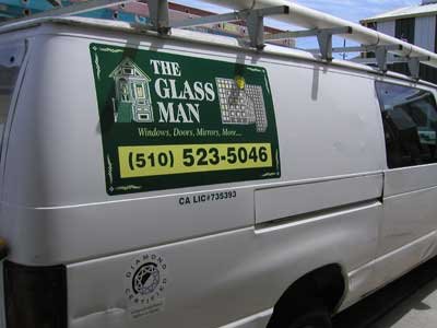
And finally, in the "Don't let this happen to your friends" category, I've been sent this self-designed logo. Yikes! The restaraunt owner might be an excellent business man and chef, but he's sure not a designer. If you have a friend, husband, wife, brother, sister or cousin, who shows you the logo for their business that they designed themselves, please love them enough to educate them that their logo is the public face of their business. It's got to communicate the attraction of the business. It needs to be professionally designed. Things to watch for if you can't decide if they need help: use of Times Roman (or any other Windows font: Copperplate, Papyrus, etc), drop shadows, and coastal outlines are all indicators that the logo isn't going to attract customer's attention.

One thing this logo does have going for it is the rouge/red thing. It's obvious, but obvious is a good thing when you're competing for peopple's bandwidth.

Thursday, May 04, 2006

Sally Ann Jessie of Petlane™


One of my BNI compatriots is Sally Ann Jessie. She is a pet advisor: she helps people to play with and take care of their companion animals. The product line is designed by the smae lady who founded Discovery Toys, and they are so cool I almost wish I had a pet just so I could buy some! There's an elephant toy, for example, that is amazingly adorable and rugged, for playing with your medium-sized dog.

She got this cute VW Beetle, and it had someone else's contact info and a bastardized version of the Petlane™ logo. We put her contact info on the car, and of course I had to change it to use the correct logo. Branding, baby! Keep the "corporate" identity consistent!

I'm not like the logo police or anything, though.

Saturday, April 08, 2006

The Glassman, Truck Graphics

There's a vinyl graphic product that 3M created, and licensed to vendors all over the country. It's a large, colorfast print, with an adhesive on the back that is wrinkle and bubble free in the hands of anyone with patience.

I love using it.

This fleet of vehicles all got either magnetic signs or graphics applied directly to the trucks or vans. I merely duplicated the design the client made for herself some years ago. While my real strength is in design, I acknowledge that some people need me for my project management and production skills. And that's fine, just not as exciting.

What IS exciting is what I'm writing about over at my other blog.

Saturday, March 11, 2006

Illustration, cover art

I love this kind of project. This is a cover for an artist directory. Donna Layburn is a client and friend from a few years back now. She got onto the board of directors for the Frank Bette center, and then commissioned me to make this cover for them. They'd tried using artist volunteers, but with limited success. So under huge deadline pressure, she called me up and gave me the job. She told me, "It's got to be something that looks like it could sit on a coffee table. It's got to be about the art." The time was so compressed that no one was sure if my cover was going to make it to the press, so there was some confusion. But I pressed on! When she saw what I made, she left me this message for me.


donnastestimonial.wav
Powered by Castpost

I like doing one or two pure-design type projects each week. More than that I think I might begin to feel chained to the computer.

Tuesday, February 21, 2006

Perhaps I AM very good

The client wants his favorite tattoo as his logo.
So, an hour later, I've recreated it as a print-capable bit of art.

Monday, February 06, 2006

Looking at old work

I've made a few sandwich signs. Only highway signs and traffic signals are more interactive. A sandwich sign sits in the middle of pedestrian flow, beckoning people to explore the adjacent establishment.

I designed the graphics and built this sign for C'era Una Volta. It's very heavy, to resist getting blown down. It's very tall, so you can see it. And I really like the graphic I came up with.

It's nearly two years old, has sat out in all kinds of weather, and it still looks good. The value of this sign is something I can't calculate; it's up to the proprietors. I do know that if I average the original expense over the expected lifetime of the sign, it's around 40c per day.

The hardest thing about sandwich signs is that they are not user-friendly. They can never really be heavy enough to withstand wind, nor can they be light enough to be easily moved. It's a system problem without a solution set. When a client asks for one, I work very hard to set their expectations so they will be pleased with the final result.

Wednesday, January 04, 2006

Negotiating after the fact

Dang it.

I've got a client who wants me to give away a design. This person got so frustrated during our conversation they hung up on me.

I think this might be a signal (because of how this client came to me, and how we began our work together) that it is time for me to focus in and specialize. I've been resisting this, because I know I appreciate working with people who are able to fulfill all my needs for a given project... but the world is certainly moving towards greater specialization. I can see where it could be more efficient. And I could control the beginning of my relationships better, and head off this sort of collision.

Dang it, I hate when agreement becomes argument.

One thing that is tough for many clients to understand is that I own my designs. I didn't set up the industry that way. But that's how it is, and that's how the IRS views it. Even if I give away me design, it's a piece of real property and I will owe taxes on it if it passes out of my control.

I listened to an architect today. He described how the process of designing a space results in ideas that are his, and he owns them. The drawings are used to communicate with a builder how to create those spaces, but the drawings are not the product: the ideas are. I was impressed to hear something graphic designers have to explain to their clients is something he has to explain, too, but it makes perfect sense.

Anyway, I'm all hepped on stress chemicals after that phone call, and I don't like it. I haven't done any yoga for a month it seems, so perhaps I'll take some time off right now and be good to myself.