Friday, December 30, 2005

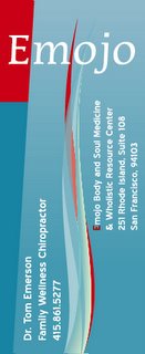
Emojo business card


My friend Tom Emerson is discovering his right livelihood as a chiropractor. His adjustments combine energy, control, grace, and flow into a healing practice that is truly extraordinary. He needed a card that reflected these qualities, and this design fit pretty well. While I was trying to work within our discussed framework, this swooshy thing kept bumping into me, and so I decided to run with it a little ways.

I try very hard to honor a client's budget above all else. Sometimes this means the design is less than it could have been. In Tom's case, however, spending more time would likely not result in a better looking card. I got lucky, and the best design happened very quickly.

One thing: it's an odd-size card. Tom likes that it doesn't fit into people's card holders. When a designer is blessed with the chance to work on a non-standard substrate, he'd better make some use of the extra capacity! So that's one reason I quickly settled on this long, flowing water/fire shape extending the length of the card. I had the space, so I used it for something that wouldn't fit on a normal length card.
Friday, December 23, 2005

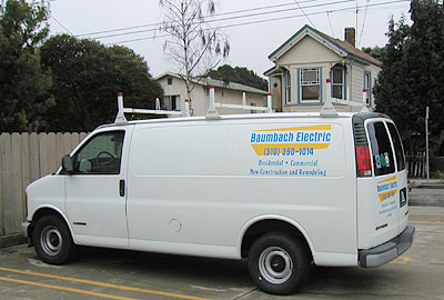
Baumbach Electric's new van


I love small, quick jobs and easy-going clients. Bruce Baumbach, electrician, called me yesterday and asked if I would letter his van. Would I! And here it is, ready to go, 24 hours later!

I charged $300 to letter two sides and the back. If I take the time to actually price this out per the letter, plus layout and file prep and all the other "industry standard" upcharges, it ends up being a $485 job. Many of my clients act as if spending $500 is going to send them to the poorhouse. Don't whine-- getting your name out there on your vehicle is the most cost-effective marketing dollar you can spend. How come Bruce saved $185? One main reason: during our first telephone call, I got a tickle that told me he was going to be an easy client. He didn't want lots of designs thrown at him, he just needed letters on his van, with maybe some "contrasting color" to help his name jump out.

He trusted my choice of letterstyle, and respected the fact that if he wanted some "logo design" I was going to charge him my logo design rates. He didn't nit-pick about the color of blue I had in-stock. He has email access and could look at a layout as soon as I finished it. He showed up with the van at the time we agreed upon.

He's clearly been in business long enough to know that any job worth doing is worth doing "good enough." I really respect that. So Bruce got the steep "get the job done and don't bother me" discount.

Wednesday, December 21, 2005

Art happens


This graphic showed up while I was working on a very different looking design. I'm entertaining the notion of assembling a show of the art that proceeds from my logos. It'd be fun, to see logos as art, stripped of their context.

Saturday, December 17, 2005

Sign Install at EMOs


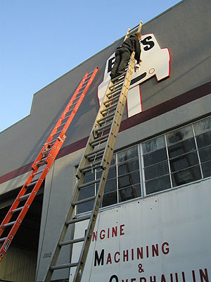
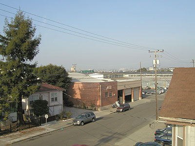
Here's a pic of my sign guy, Ken, 20 feet in the air, installing Sandie and Emo's new sign. I unmounted the previous, 120 pound sign all by myself (with two ropes and a ladder). The new sign went up very nicely. The old sign was installed 20 years ago by Emo and his dad. Oh! I have a pic of how high this is, from the other perspective:

I don't know why that's a big deal to me, but it is. Too bad it was a misty afternoon (felt like 40 degrees); had it been clear the Oakland Hills would have been beautiful.

The most surprising and memorable comment of the day: Ken said to Sandie, "I think Bob must have been my brother in a previous life." WTH!?